How modern studios should price retainers in 2026

Lina Heuer
Co-founder · Voxifyme

Most teams treat micro-interactions like garnish — sprinkle them on when the page feels empty. We think about them earlier: each interaction is a tiny piece of communication, and like all communication, it can be sloppy, polite or sharp.
01 — Why this matters
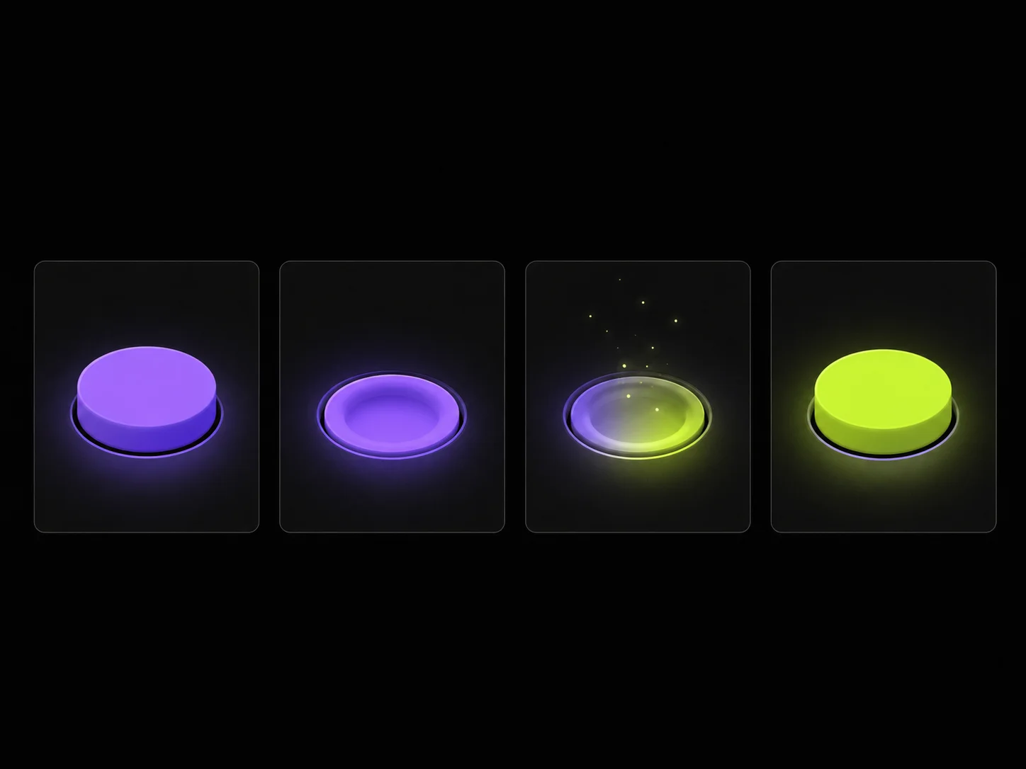
When a user clicks a button, three things happen in their head: did the click register, is something happening, what changed. If the answer to any of those is unclear, you have a bug, even if the system is doing the right thing. Micro-interactions are the answers.
02 — Five principles
- 01. Always acknowledge the input within 80ms.
- 02. Make state changes legible — color is not enough.
- 03. Don’t animate decoration; animate cause and effect.
- 04. Respect
prefers-reduced-motion. Always. - 05. If it would survive on a 60fps device from 2014, it’s probably fine.
“The fastest way to make a product feel cheap is to animate things that didn’t need to move.”
03 — Examples we keep coming back to
Linear’s issue-status switcher. Things 3’s magic plus. Arc’s little tab close animation. Each is doing the same thing: turning a state change into a tiny story.
04 — Takeaway
If you can’t justify a motion in one sentence, ship without it. The pixels are precious; the user’s patience is shorter than yours.